Color Systems · Design Systems · Accessibility · Brand
How I Pushed Back on Wieden+Kennedy and Built Eli Lilly's Color System
Wieden+Kennedy proposed a brand red that failed accessibility. Finding an accessible alternative meant navigating a tight constraint: staying clear of Johnson & Johnson's signature color. This is how I solved both problems — and built the color architecture that now powers Eli Lilly's entire brand portfolio.
Project Overview
Eli Lilly's brand colors were built for print. Bold, saturated, unmistakably on-brand — and completely unusable in a digital product at scale. When Wieden+Kennedy delivered a new brand red as part of a corporate identity refresh, it failed WCAG accessibility standards. Finding an accessible alternative wasn't just a technical problem — I also had to stay clear of Johnson & Johnson's signature color, which constrained how far I could move in the tonal space.
Using HCT — a perceptually accurate color space that models how humans actually see color — I converted Lilly's entire print palette for digital, resolved the W+K conflict with data, and built a tonal framework that now powers every component state in the Lilly Design System.
Project Details
Converting Lilly's Print Palette for Digital
Lilly's brand palette was designed for print — rich, saturated colors that looked authoritative in marketing materials. Wieden+Kennedy had done their job well. But print colors don't translate directly to screens. What reads as bold in a magazine fails contrast requirements on a button, and what feels differentiated in a campaign can read differently at interface scale — especially when a competitor owns adjacent color territory.
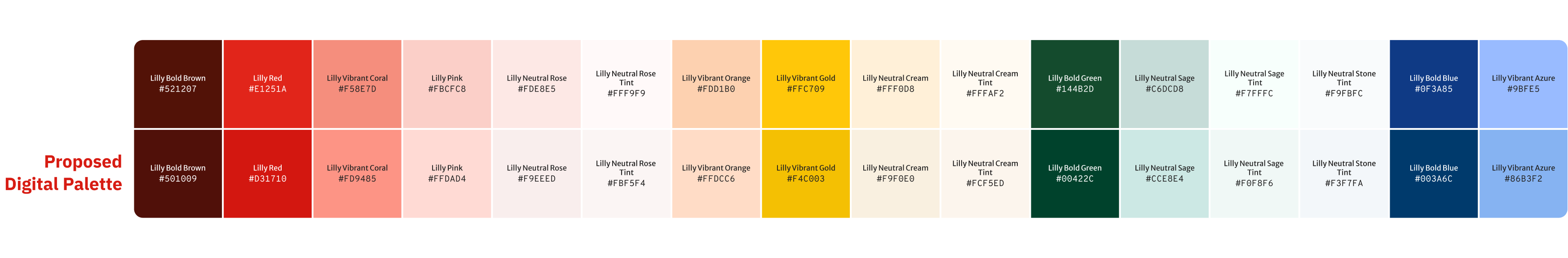
The full Lilly palette needed digital equivalents — close enough to maintain brand recognition, but adjusted for the accessibility and visual requirements of the Lilly Design System.
Brand print palette (top) vs. brand digital palette (bottom) — each color converted for screen while preserving brand identity
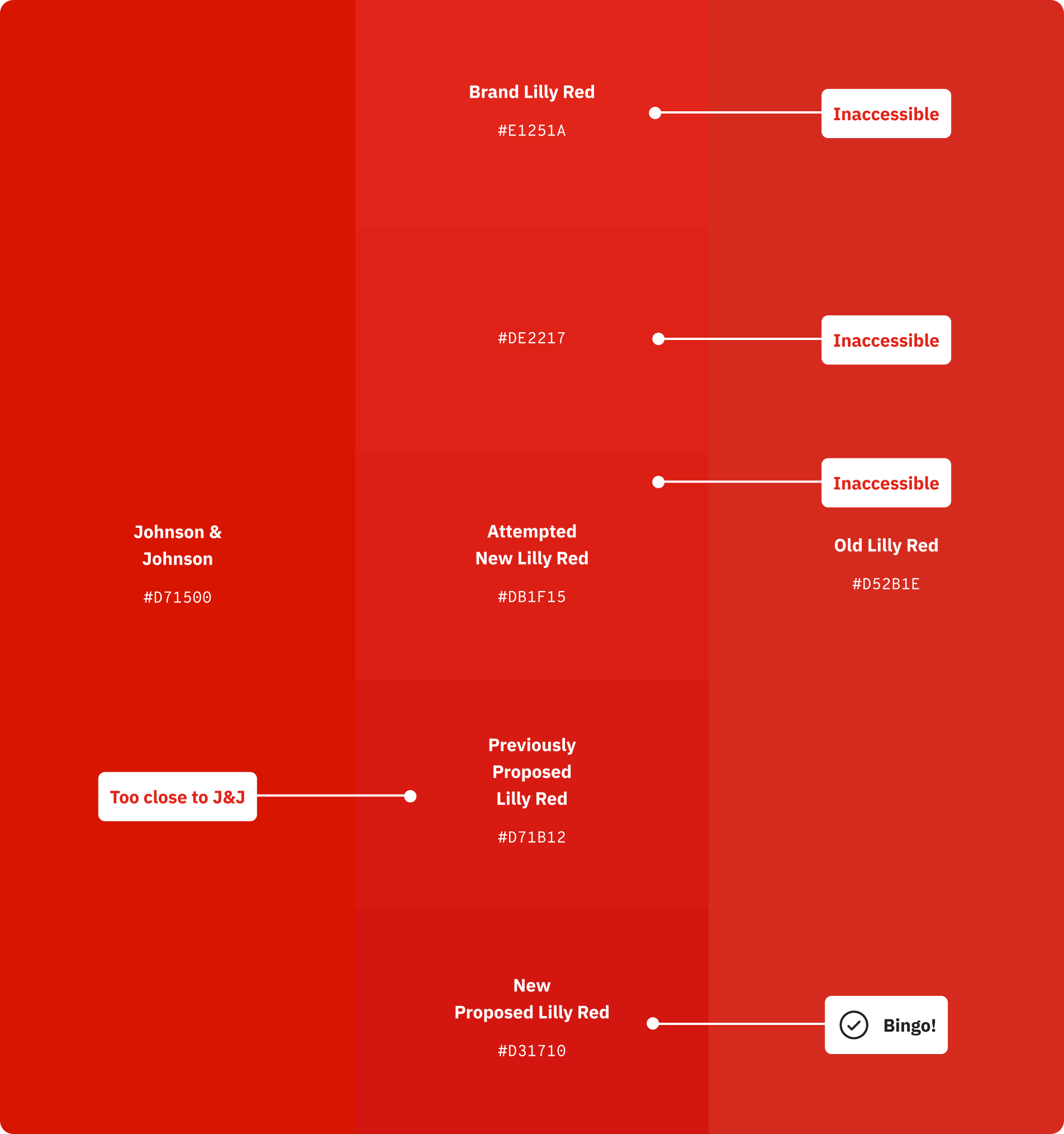
The W+K Red Problem
Lilly's brand red was the most contested color in the system. Wieden+Kennedy's proposed digital red failed WCAG accessibility contrast requirements. The challenge in finding an alternative was navigating a tight constraint I identified early: Johnson & Johnson owns the adjacent red territory, and any solution that moved too far in their direction would create a different problem. This narrowed the viable solution space significantly — and made each iteration more deliberate.
Each candidate was tested against accessibility standards and evaluated for competitive differentiation. Going lighter in the tonal space to get closer to the original brand red reintroduced accessibility failures. The resolution was to go one tonal step darker than the previously proposed red — accessible, differentiated, and close enough to the original brand identity that it could be defended.
The red iteration process — from the original inaccessible brand red through multiple candidates to the final approved digital Lilly Red (#D31710)
The outcome: A digital brand red that passed WCAG, stayed clear of J&J's color territory, and preserved enough of the original brand character that the agency could stand behind it. The Lilly logo retained its original #E1251A — the system red and the logo red serve different functions and don't compete.
Mapping the Full Red Spectrum
Once the digital brand red was resolved, it needed to be mapped across the complete tonal scale — from near-black at tone 9 through to near-white at tone 95. This scale powers every component state in the system: dark backgrounds, light backgrounds, hover states, focus rings, disabled states, and everything in between.
The HCT framework made this tractable. With hue held constant at 27, the full tonal range was generated perceptually — each step representing a proportional change in perceived lightness rather than a mathematical one. The result is a scale where the accessible range is clearly bounded: tone 24 and below works with light text, tone 72 and above works with dark text.
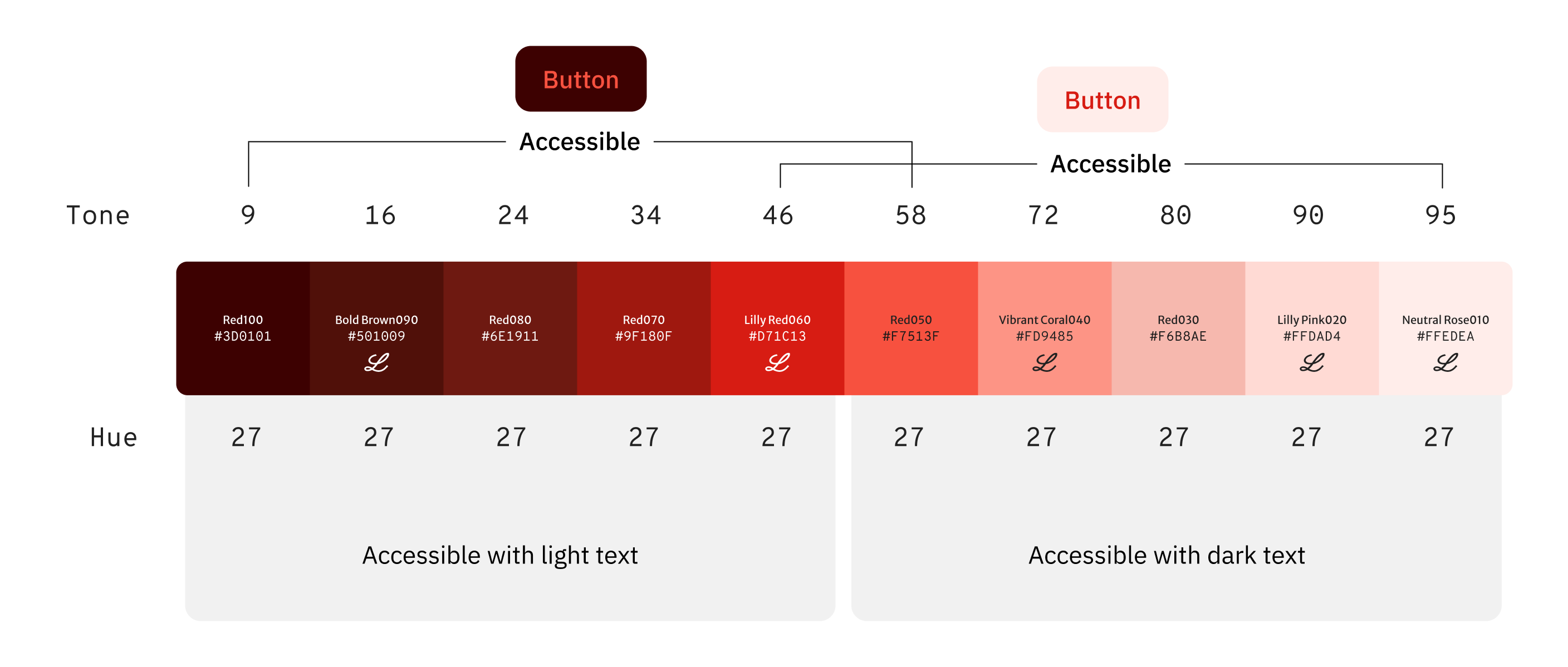
The complete Lilly Red tonal scale — accessible ranges clearly defined for both light and dark text combinations
Why HCT — and Why It Matters
Traditional color spaces like HSL describe color mathematically, but they don't reflect how humans perceive it. Two colors at the same HSL lightness can look dramatically different in brightness. This creates a problem when you're trying to build a system where color relationships are predictable and accessible by design.
HCT — Hue, Chroma, Tone — is a perceptually uniform color space developed by Google as part of Material You. Tone corresponds to actual perceived lightness, which means you can step colors across a tonal scale and trust that each step will look like a proportional change to the human eye. For accessibility, this is the difference between guessing and knowing.
The practical upshot: By working in HCT, we could take any brand color, map it to its correct position in the tonal scale, and generate accessible light and dark variants with confidence — without losing the hue or vibrancy that made the color feel on-brand.
Building the Digital Palette
The brand's print palette was the starting point — not the destination. Print colors are designed for ink on paper, with different perceptual rules than light on a screen. The first task was converting those colors into their correct HCT equivalents and understanding where they sat in the tonal space.
Hue-matching within each color's own space was critical. Brand colors that appeared close in print sometimes diverged significantly in digital. By aligning them within the HCT framework, we created a palette where tonal transitions between shades feel seamless — colors relate to each other the way a system should, not the way a print swatch book does.
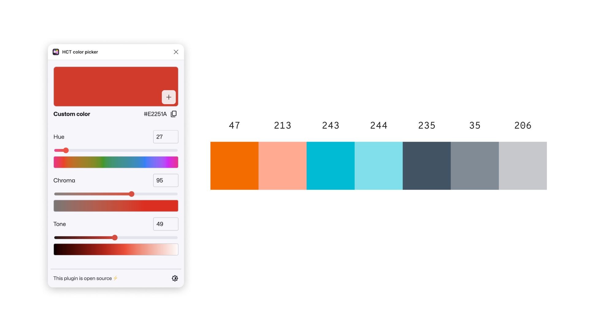
Exploration phase — using the HCT color picker to analyze candidate hues and understand their position in the color space
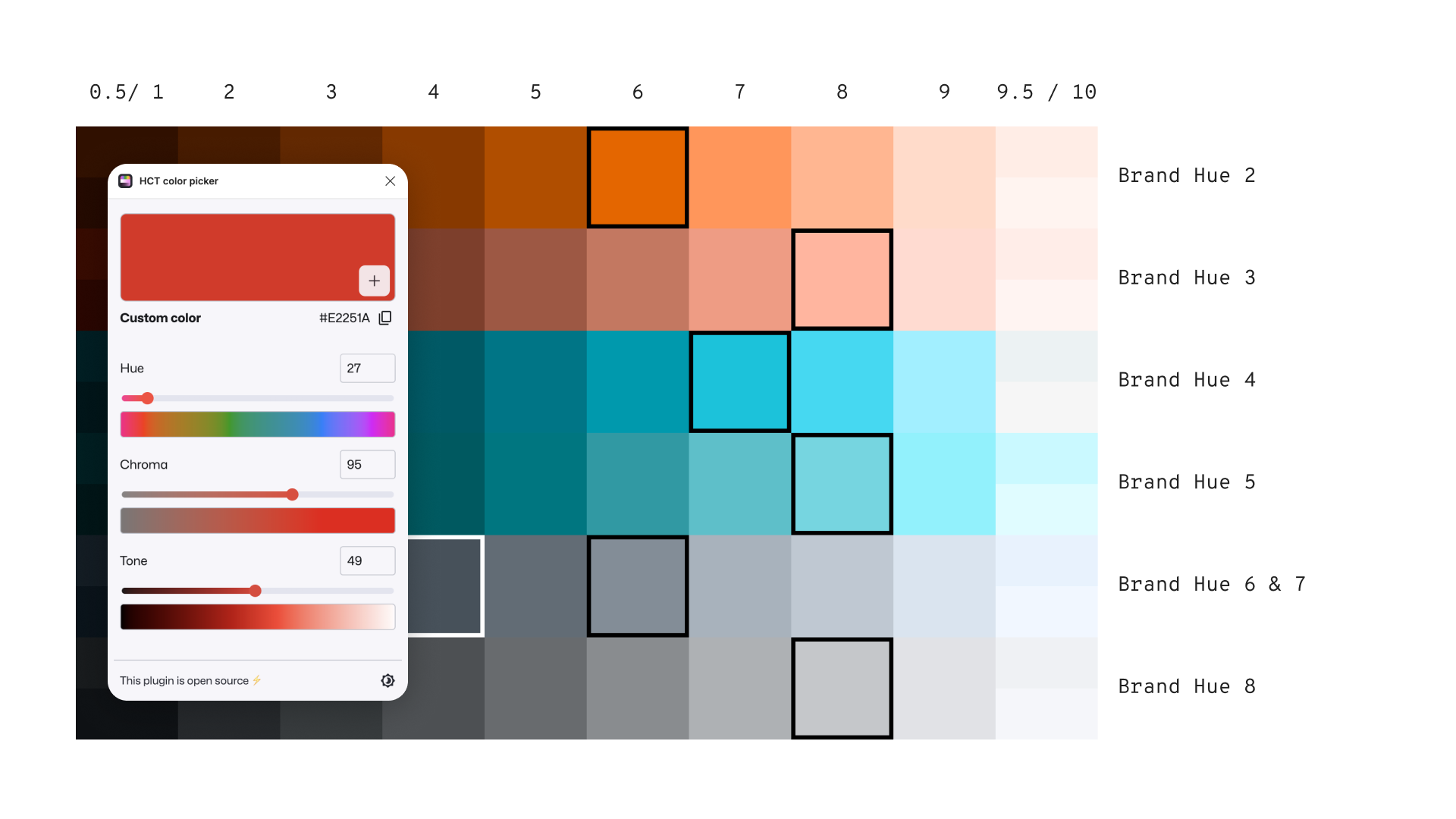
Tonal mapping — plotting brand hues across the HCT grid to identify accessible tone values for each color family
Refining Lilly Red
The brand's primary red presented the most nuanced challenge. A slight modification was needed to fit within the LDS color-stepping framework — the tonal scale used to generate component states like hover, active, focus, and disabled.
The original chroma values produced tonal steps that were inconsistent with the rest of the palette. By adjusting chroma while holding the hue constant, we arrived at a red that stepped cleanly through the scale, matched the visual weight of adjacent colors, and remained unmistakably on-brand.
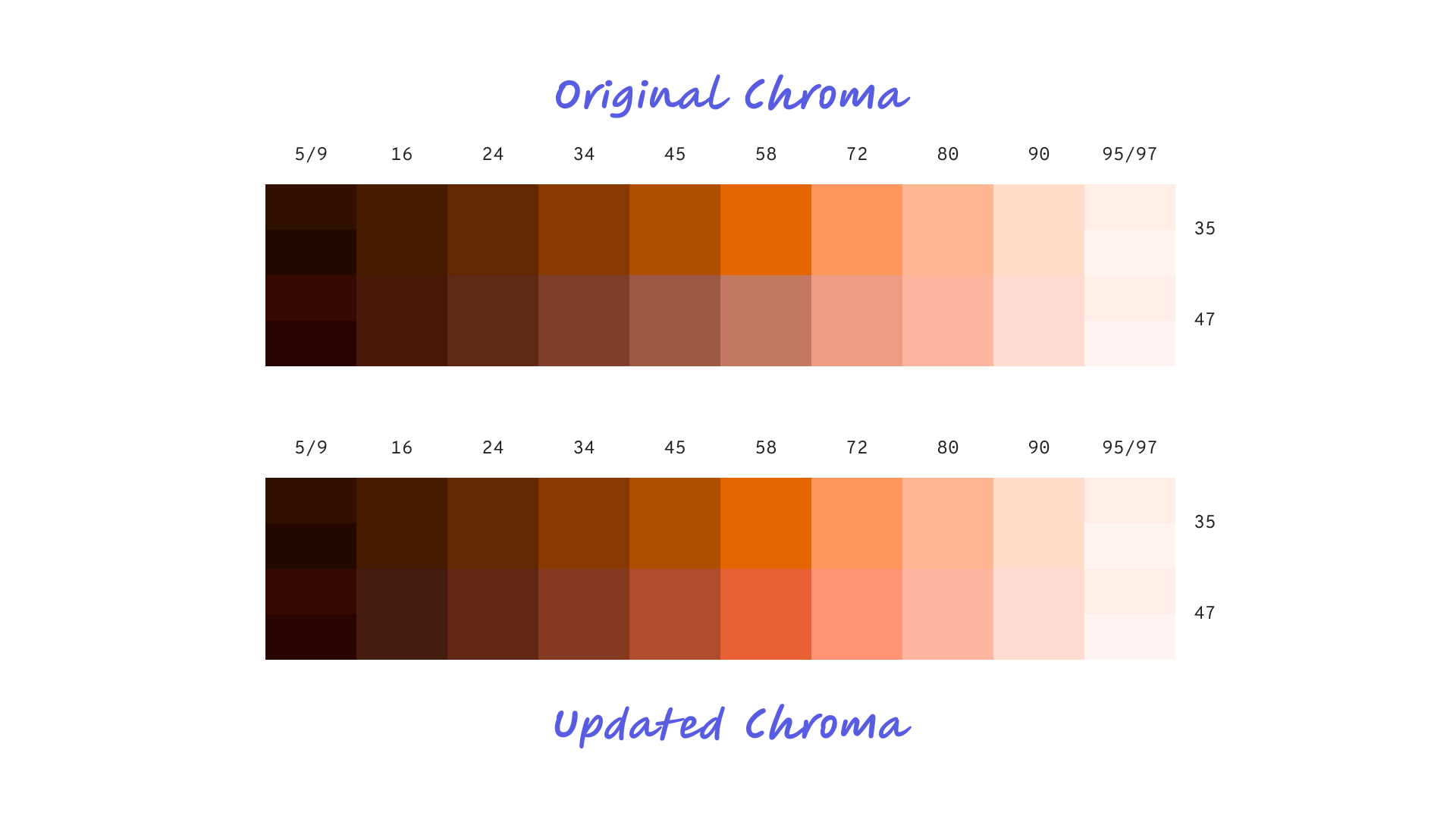
Original vs. updated chroma — adjusting chroma while holding hue constant to produce consistent tonal steps
Knowing When to Merge
One of the less obvious decisions in building a tonal system is knowing when two steps are close enough to collapse into one. Adjacent tones that are perceptually indistinguishable create redundancy in the system — extra tokens that developers have to manage without any meaningful visual payoff.
Using HCT's perceptual accuracy, we were able to make this call with confidence rather than intuition. Where two tones were functionally equivalent to human perception, we merged them — simplifying the system without sacrificing fidelity.
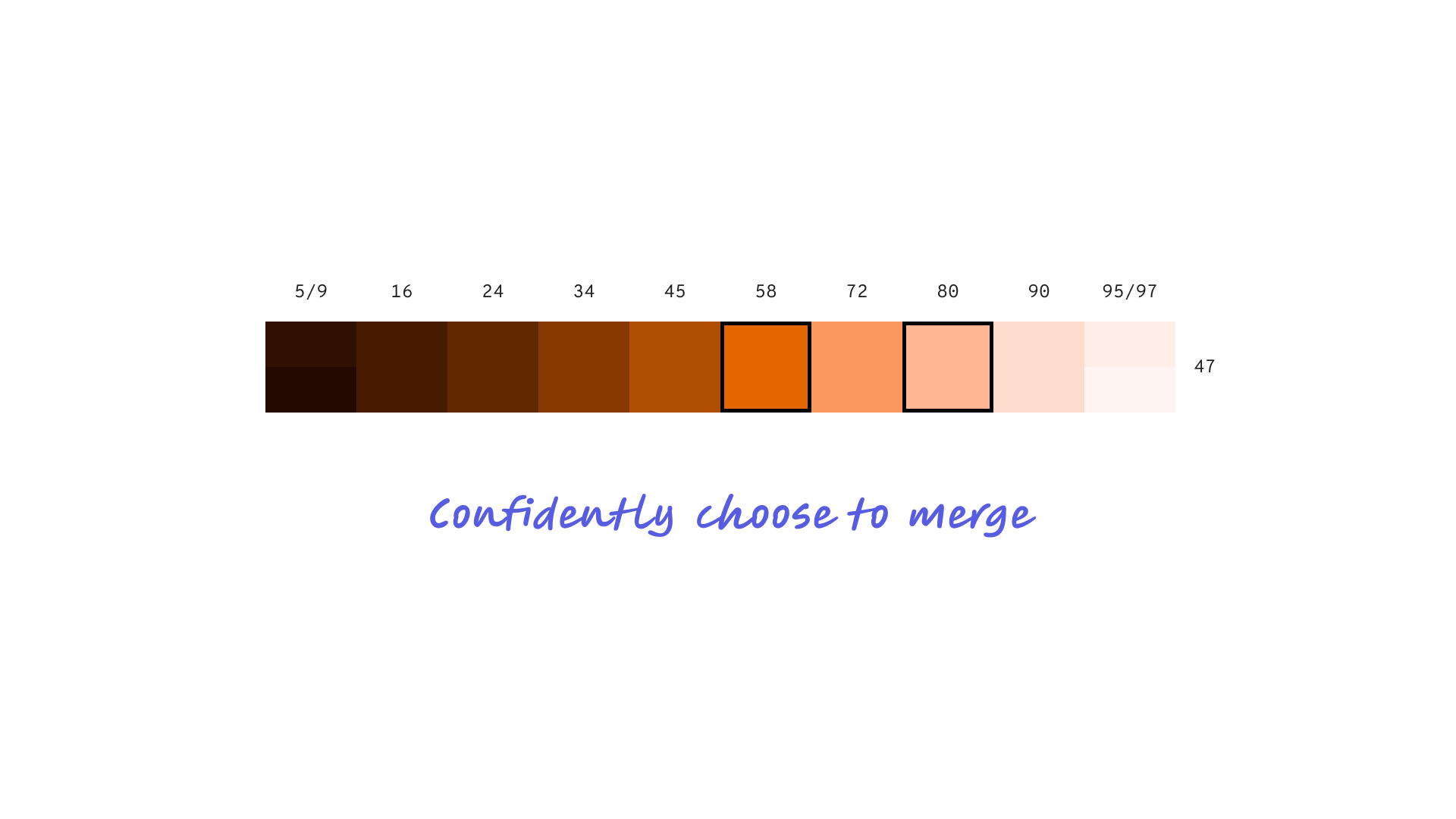
Confident tone consolidation — where perceptual difference was negligible, steps were merged to keep the system clean
The System That Came Out the Other Side
The result was a complete tonal color library spanning every brand hue — each one mapped, stepped, and validated for accessibility. The framework wasn't built for one brand. It was built to onboard any brand in the portfolio by dropping their hues into the same stepping system and generating a compliant, consistent palette automatically.
Component states across the entire design system — hover, active, focus, disabled — are now driven by predictable tonal steps rather than ad hoc color decisions. Designers and developers work from the same source of truth. New brands don't start from scratch; they inherit the infrastructure.
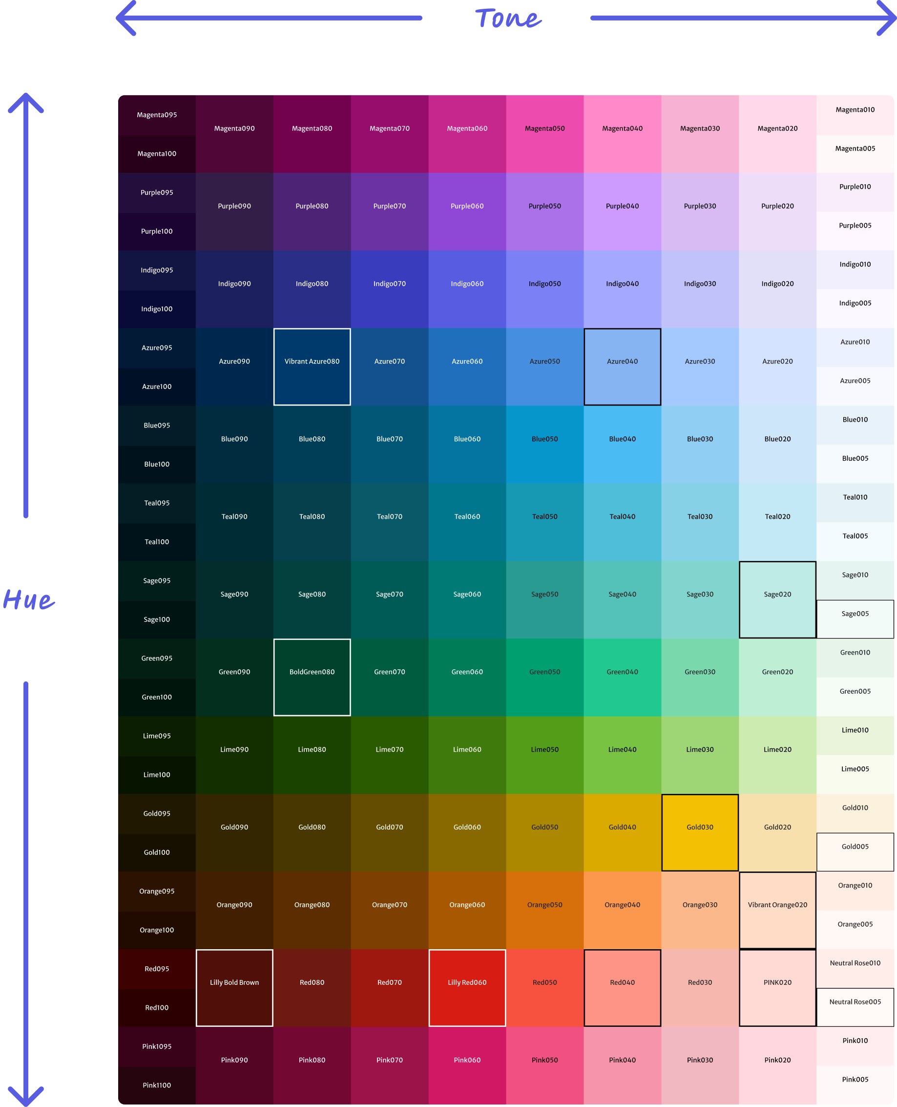
The complete LDS color library — every brand hue mapped, stepped, and validated across the full tonal range